
How do you draw an arc in Android Graphics? This article provides a quick visual sampler of arcs drawn with varying parameter values. After reading this, you will be able to use drawArc, arcTo, sweepAngle, and startAngle confidently.
Android Graphics offers very convenient methods for drawing arcs. It allows you to define an arc with a Rectangle, a start angle, and a sweep angle. Understanding how the latter two parameters work is a bit tricky, and I was a bit underwhelmed by the provided documentation. I decided to draw a small sampler to better understand the values needed to draw arcs in Android Graphics.
In all the following article, I’ll be using the symbol ° to mean « degrees », the unit of measure of angles. The physical degrees value is represented by a signed Float value for the Android platform. If the value used is greater than 360.0f (or less than -360.0f), the platform helpfully scopes into a -360.0f to 360.0f range automatically.
Arc-drawing functions provided by Android Graphics
There are a few different functions to draw an arc, providing various ways to define the rectangle in which the arc is inscribed.
You can use a RectF object, or the float coordinates (x or y) of the 4 edges (top, left, bottom, right) of that rectangle. Alternatively, Compose’s drawArc() also allows the rectangle to be defined with the full coordinates (Offset object) of its top left corner, and its Size (width and height).
This article focuses on several Android methods which can be used to draw an arc on screen, or define an arc-shaped Path (for example, for clipping).
Some of them hark back from the original Canvas era, and others were added in the Jetpack Compose library, though they are just a wrapper for those same Canvas operations.
Specifically, I’ll be talking about the following functions in Android Graphics: drawArc, arcTo, addArc, ArcShape. All of these functions have parameters to define a start angle and a sweep angle to define the arc.
The arc functions in current Android Graphics libraries
In all the current libraries of Android Graphics, an arc requires a startAngle and sweepAngle to be defined. The parameters to describe the start point or placement of the arc in the Canvas are not always the same, but involve a rectangle in which the arc will de inscribed.
From API level 1
- android.graphics.drawable.shapes.ArcShape(float startAngle, float sweepAngle): The arc shape starts at a specified angle and sweeps clockwise, drawing slices of pie. In this case we define a vector representation of a shape. In order to size it and draw it, more info will need to be supplied.
- startAngle float: the angle (in degrees) where the arc begins
- sweepAngle float: the sweep angle (in degrees). Anything equal to or greater than 360 results in a complete circle/oval.
- Path.addArc(RectF oval, float startAngle, float sweepAngle)
- Path.arcTo (RectF oval, float startAngle, float sweepAngle, boolean forceMoveTo)
From Artifact: androidx.compose.ui:ui-graphics
If you are already using Compose, you probably already have this dependency in your build script, but just in case, make sure you have this
// in you version catalog file, using a composeBom
[libraries]
androidx-compose-bom = { group = "androidx.compose", name = "compose-bom", version.ref = "composeBom" }
androidx-ui-graphics = { group = "androidx.compose.ui", name = "ui-graphics" }


// in your app build file (Kotlin DSL format)
implementation(libs.androidx.ui.graphics)DrawScope.drawArc(…): Draw an arc scaled to fit inside the given rectangle.
Parameters:
| Parameters | Documentation |
| color:Color (or brush: Brush) | Brush or Color to be applied to the arc |
| startAngle: Float | Starting angle in degrees. 0 represents 3 o’clock |
| sweepAngle: Float | Size of the arc in degrees that is drawn clockwise relative to startAngle |
| useCenter: Boolean | Flag indicating if the arc is to close the center of the bounds |
| topLeft: Offset = Offset.Zero | Offset from the local origin of 0, 0 relative to the current translation |
| size: Size = this.size.offsetSize(topLeft) | Dimensions of the arc to draw |
| alpha: @FloatRange(from = 0.0, to = 1.0) Float = 1.0f | Opacity to be applied to the arc from 0.0f to 1.0f representing fully transparent to fully opaque respectively |
| style: DrawStyle = Fill | Whether the arc is a line or a filled shape |
| colorFilter: ColorFilter? = null | ColorFilter to apply to the brush when drawn into the destination |
| blendMode: BlendMode = DefaultBlendMode | Blending algorithm to be applied to the arc when it is drawn |
The non-arc-specific parameters in drawArc
This is a little detour about the other, non-geometry related parameters of drawArc: useCenter, draw style, alpha, colorFilter, and blend mode.
DrawStyle and useCenter parameters
To start with DrawStyle, this can be considered as an enumeration of two possible values, Fill and Stroke (to simplify). UseCenter is a Boolean value.
Each parameter has 2 values, so let’s illustrate them with the 4 possible effects they would have for a given drawArc call.
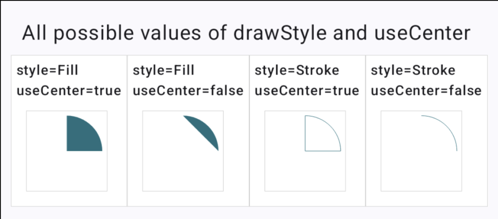
The code for these arcs, with the variable Values replaced by drawStyleValue and useCenterValue is below. On the illustration, the actual values are shown above each Box.
drawArc(
style = drawStyleValue,
useCenter = useCenterValue,
color = NICE_COLOR,
startAngle = 0.0f,
sweepAngle = -90.0f,
topLeft = Offset.Zero,
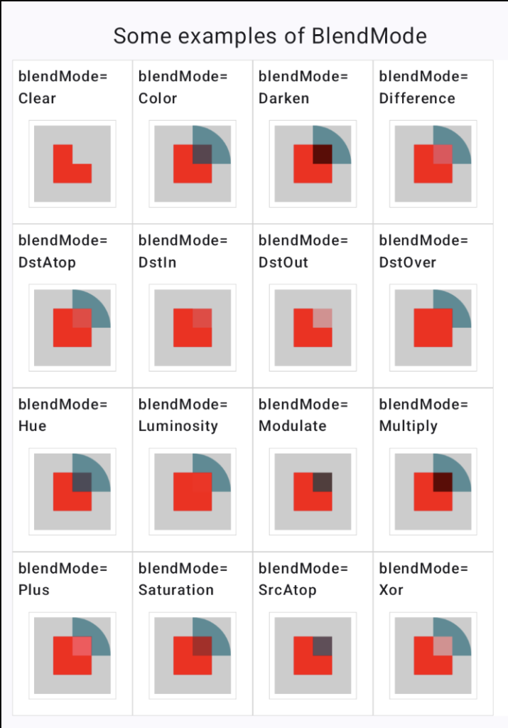
)Alpha, ColorFilter, and BlendMode parameters in drawArc
The alpha, colorFilter, and blendMode parameters describe how the color pixels of the arc will be applied on the underlying canvas. By default, the arc will be opaque and cover up anything that is underneath, like a (non-transparent) sticker on a poster. Decreasing the alpha will make the sticker overall less opaque.
Defining the color used to draw the arc itself is done with either a Color parameter, or a Brush. Use the more complex Brush format if you want to control the thickness of the Stroke, or want the color to have variations like stripes or a gradient.
Optional parameters ColorFilter and BlendMode
Changing the colorFilter value allows you to modify the color given to the arc itself. For example, if you are making all of your graphics slightly yellow for a sepia effect, irrespective of their initial color, this can be done with the colorFilter.
Finally, the BlendMode defines how the arc object will be drawn atop the underlying elements of the canvas (if any). I have a couple of articles describing how the values work.
Here is an example building on the other arc parameters I used to give you an idea. The image is made with a filled arc (the same one as used for useCenter and drawStyle) drawn atop a small red square. The Box in which they are drawn has a light gray background color. The arc is drawn with a non-1 value of alpha to allow for more color blending. For each square, the value of BlendMode used is written above the box.
Drawing arcs with varying sweep angles, same start angle
Using drawArc (or arcTo) for arcs with varying sweepAngles
The following diagram describes the basis for the following set of illustrations.
The diagram contains 5 arcs, all of them using the same startAngle of -90°:
- the filled dark green arc is using a 30° sweepAngle
- the light green arc has a -30° sweepAngle
- the red arc has a -90° sweepAngle
- the blue arc has a 120° sweepAngle
- the light gray full arc oval) has a 360° sweepAngle
Note that replacing -90° for the start angle by 270° (i.e. a startAngle value of 270.0f) would give the same results.
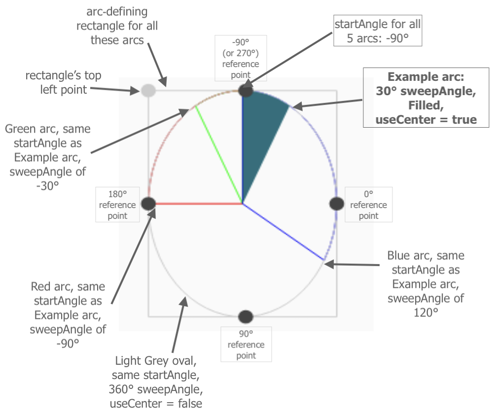
The illustration shows the 5 arcs’ “construction lines” in grays:
- the rectangle in which the arc is inscribed. As we can see, the rectangle is always big enough to contain a full 360° oval.
- the reference points (shown as big dots) that are used for the startAngle
The base code used here:
val startAngle = -90.0f
drawArc(
    topLeft = topCenterOffset,
    color = myColor,
    useCenter = true,
    startAngle = startAngle,
    sweepAngle = mySweepAngle,
    size = rectangleSize,
    style = Stroke() // or Fill
)
As we can see, the sweepAngle value gives both how much of the base oval (the one in gray here) is drawn, and the direction in which it is drawn. A positive value draws the arc in a clockwise direction from the starting point, and a negative value draws it counter-clockwise. This is shown be comparing our Example arc in dark green which sweeps 30°, and the light green arc which has a sweepAngle of -30°.
Drawing arcs with varying start angles
The following illustrations reuse the same 5 sweepAngle values for each box, with varying startAngle values, as indicated in each box.
Here is the detailed decription of the 5 sweepAngles repeated in each box (the same as in the precedent diagram):
- the filled dark green arc is using a 30° sweepAngle
- the light green arc has a -30° sweepAngle
- the red arc has a -90° sweepAngle
- the blue arc has a 120° sweepAngle
- the light gray full arc oval) has a 360° sweepAngle
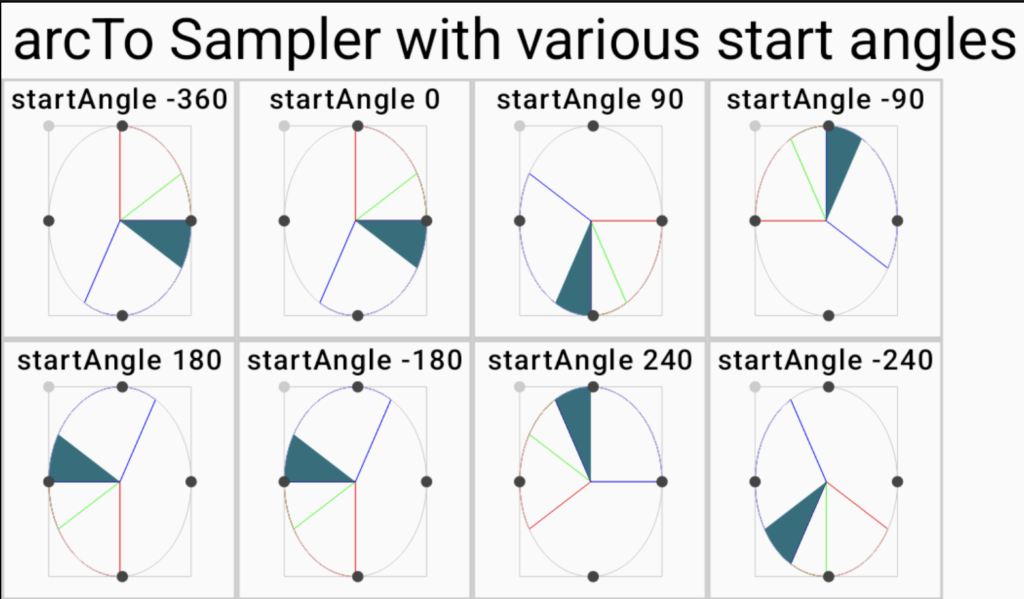
Once the starting point is chosen, the sweep angle draws the arc either clockwise or counter-clockwise from this starting point.
Note how using a negative float value for the startAngle determines which way (clockwise or counter-clockwise) the arc’s starting point is determined relative to the 0° reference point. As described in the documentation, the startAngle 0° is set at the clock position « 3 o’clock ».
Moving to a 90° startAngle is done clockwise from that start point, meaning your arc starts at the « 6 o’clock » reference point, i.e. the lowest point on the oval. Conversely, moving to -90° for the start point entails moving counter-clockwise — because it is a negative value — from the 0° reference point up to the (topmost) « 12 o’clock » point.
Maybe a better name for the « startAngle » would be startingPointAngle », but I can see how that would be too long a name!
Again, the (Compose) code used to define all these arcs is the same as the precedent example, just with varying startAngle values.
That’s it! Hope these illustrations help you as much as they have helped me to make sense of drawing arcs in Android.
Fuller code snippet for this Cyan pie slice:
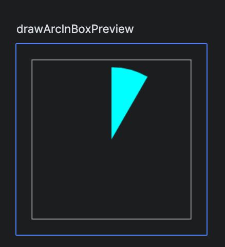
@Composable
fun ArcInBox(startAngleValue: Float, sweepAngleValue: Float) {
    Box(modifier = Modifier
        .size(100.dp) // need a size here, otherwise Box not shown
        .padding(8.dp)
        .border(color = Color.LightGray, width = Dp.Hairline)
        .padding(4.dp)
        .drawBehind {

            drawArc(
                topLeft = Offset.Zero,
                color = Color.Cyan,
                useCenter = true,
                startAngle = startAngleValue,
                sweepAngle = sweepAngleValue,
                size = size, // use size of box
                style = Fill,
            )
        }

    ) // box content intentionally left empty
}
Source code
All of the source code for these examples is available.
References
- Compose DrawScope drawArc documentation
- Path.addArc documentation
- Path.addOval documentation
- Path.arcTo documentation
- Another explanation page on drawArc, which uses the classic clockface reference to explain how the angle parameters work